UX/UI Case Study
Learnet - Smarter Academic Guidance
Helping students navigate overload and focus on what truly matters
Timeline
Jan - Feb 2025
Product
B2C app
Target audience
Academic students
Project
Personal initiative


Overview
Designing Clarity in an Overloaded Learning Space
Access to learning has never been the problem, direction has. Students are surrounded by courses, platforms, and recommendations, yet often feel unsure what to learn, in what order, and why. Most learning platforms focus on delivering content, but offer limited support in helping students navigate their goals, progress, and personal learning needs.
This project examines how a personalized learning system can provide structure without limiting exploration.
By combining user research, competitive analysis, and behavioral insights, I designed a concept that adapts to each student over time, guiding them from open ended exploration to focused, goal driven learning paths that evolve as they do.
01.problem statement
Drowning in Options, Missing Direction
Students struggle to filter through the abundance of available content to find what truly fits their personal learning needs.
Most platforms focus on structured courses, lacking accessible and relevant materials that address individual academic challenges.
“There’s so much out there… I don’t know where to begin”
“It often feels like platforms just tell me what’s popular, not what actually fits me.”
02. Industry Context
One-Size Platforms. Missed Needs.
While many EdTech platforms today incorporate smart recommendations, in the academic space, most systems still rely on rigid course models and offer only surface-level suggestions, missing deeper insight into students’ goals, habits, and long-term progress. As academic learners seek more tailored and flexible experiences, the need for systems that adapt continues to grow.
03.competitors analysis
Are Existing Solutions Really Personalized?
I chose Coursera, edX, and Udemy because they represent distinct approaches to online learning , each targeting students differently. They also share a strong academic orientation, making them relevant benchmarks for my analysis.
Feature
Smart
Student Profile
Personalized content
Learning
Path Structure
Basic profile with
limited customization
suggestionss based previous courses
Pre determined suggestions
Basic profile with
course history
Basic suggestions based on selected interests
Fixed "MicroMasters"
and program paths
Basic profile with
limited personalization
Algorithms prioritize
sales over learning
Standalone courses,
No structured paths
Learnet
Profile tailored to
goals and interests
Content tailored to interests and behavior
Adaptive learning paths
⚠️
This sign represents very limited feature.
04.user research
Are Today’s Platforms Really
Supporting How Students Learn?
I designed this survey to reveal what students actually need, not just what platforms assume. The hardest part? Asking the right questions — and listening between the lines.
“What are students
really struggling with?”
Goal
Understand how students experience academic platforms, focusing on personalization, challenges, and learning habits.
Method & Tools
25-question survey combining open-ended, scaled, and multiple-choice questions. It was distributed via Facebook and WhatsApp, collected through Google Forms, and analyzed using ChatGPT.
“What’s the easiest way to hear what students really think?”
“Whose voices are we
actually hearing?””
Participants
30 students from diverse academic fields.
Top disciplines: Engineering (30%), Economics (12%).

05. Key Insights
So, what stood out?
The research revealed key patterns in how students interact with learning platforms. Many feel overwhelmed by the sheer volume of options, struggle to find content aligned with their goals, and lack a clear sense of progression. These insights helped shape a solution focused on simplicity, relevance, and personalized learning paths.
What’s Still Missing?
66%
Struggling to find personalized content and guidance.
23%
Find it Difficult to filter
relevant information.
33%
Frustrated by scattered information across platforms.
Lack of Structure
Learners struggle to know what to learn next without clear direction.
Search ≠ Relevance
Students search often, but results rarely match their academic goals
Overwhelmed by Choice
Too many options create friction at the start of the learning process
06.user flow
From Overwhelmed to On Track
Instead of a single linear flow, the experience is built around a few interconnected flows, each tied to a key task: creating a profile, exploring relevant content, and receiving personalized learning paths. Together, they support a flexible and personalized user journey.
Start/End
Process
Home Page
decision

07.wireframes
Making Structure Student-Friendly
While the wireframes helped shape the structure and functionality, moving into high-fidelity design allowed me to refine the visual language to better serve the app’s goals. I aimed to create an experience that feels modern, approachable, and student-friendly, not just functional, but enjoyable and accessible. These screens helped validate whether the interface communicated clarity and comfortably aligned with the needs of today’s learners.

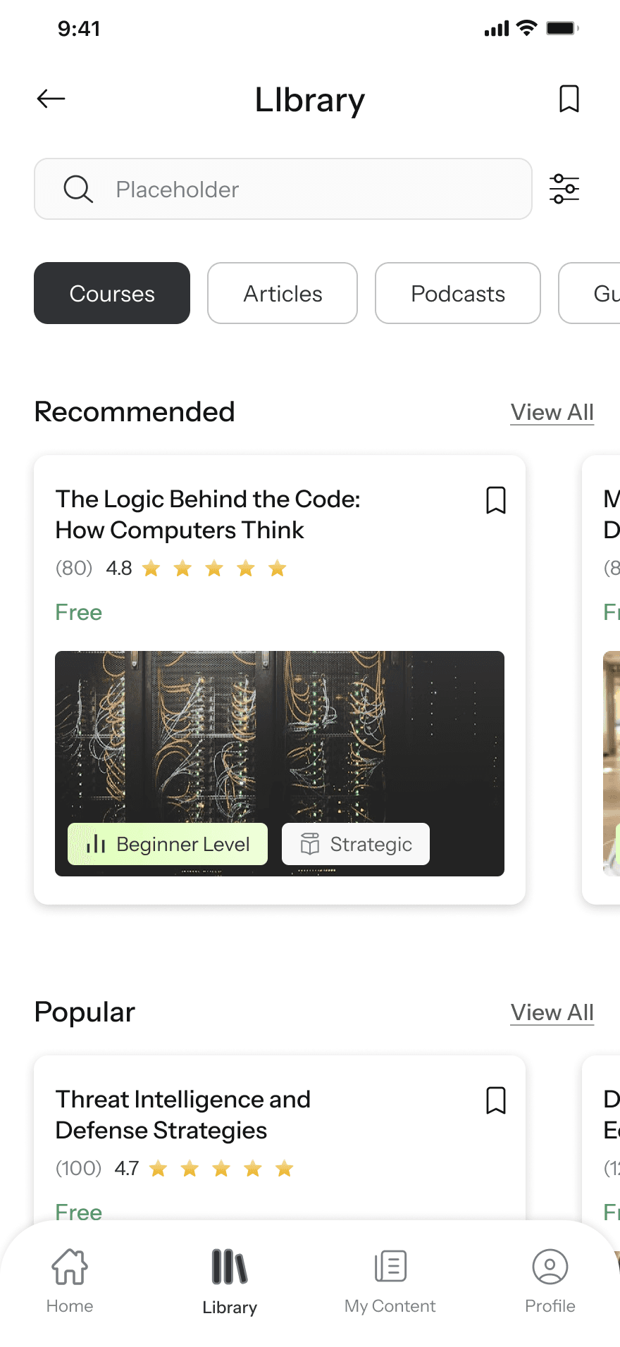
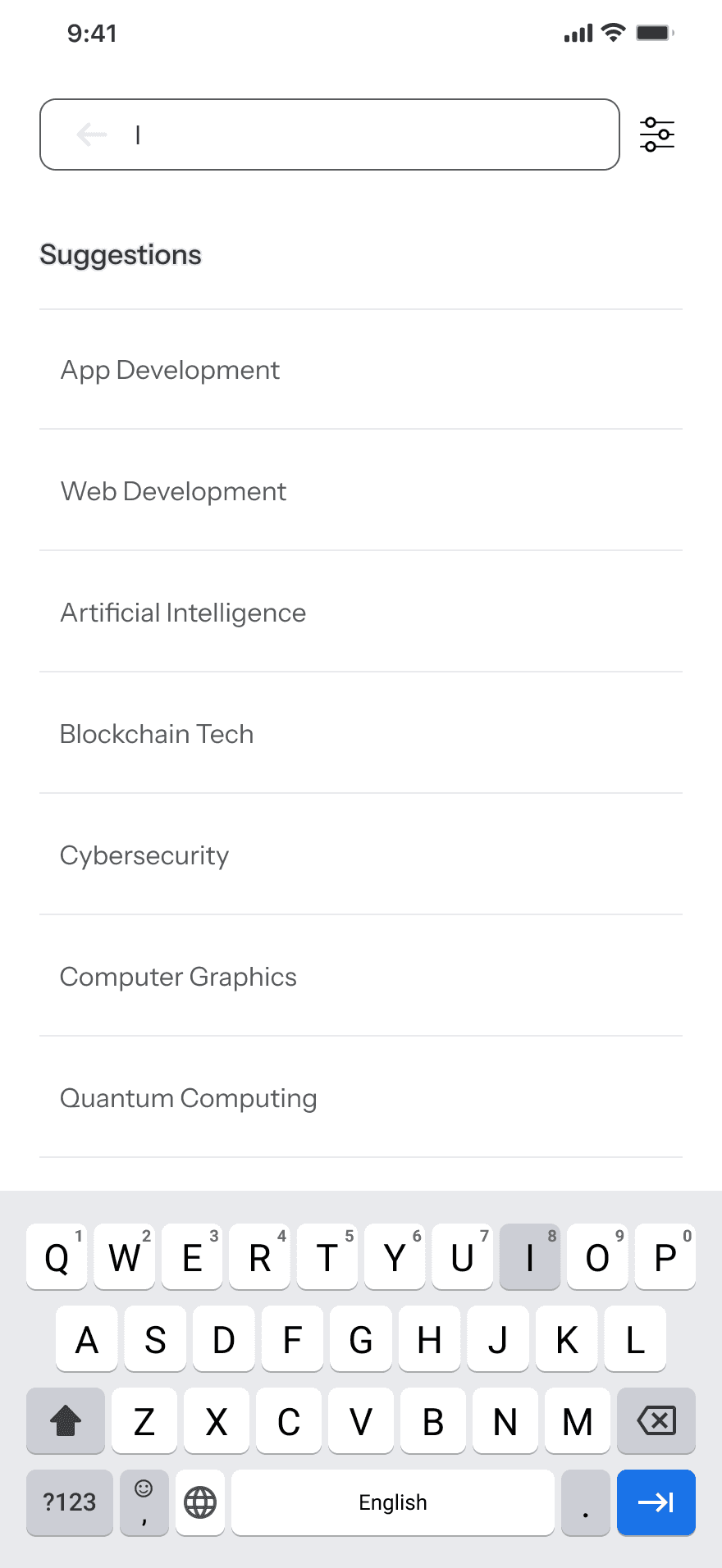
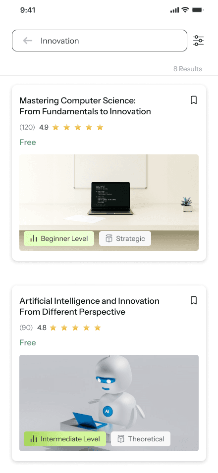
Quick access to search by keyword for any content type
Top-level tabs allow users to switch content types with one tap – no nested menus
Curated recommendations appear first to guide new users toward relevant content
Badges help users assess relevance and difficulty at a glance
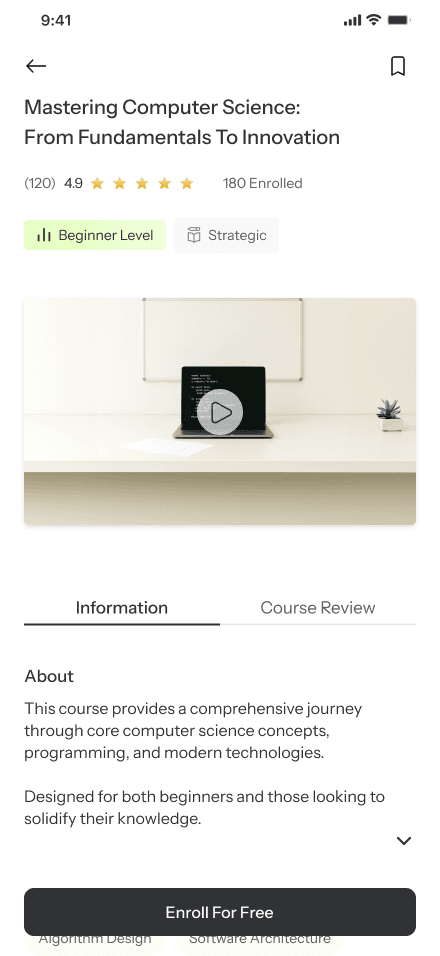
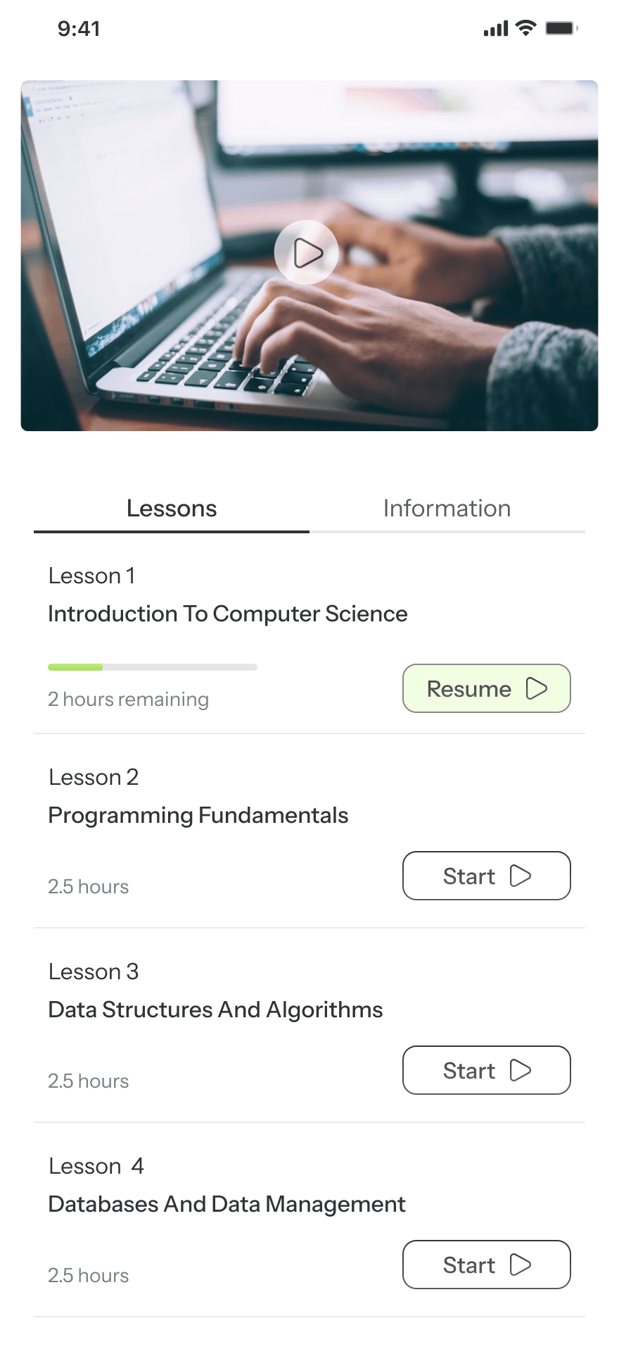
Sticky label indicates the current stage in the learning journey.
Quick access to first lesson in each course lowers friction to start learning.
Allows users to personalize their dashboard with relevant materials.
Completed status reinforces a sense of progress and achievement.

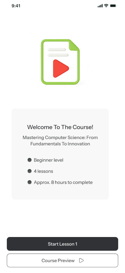
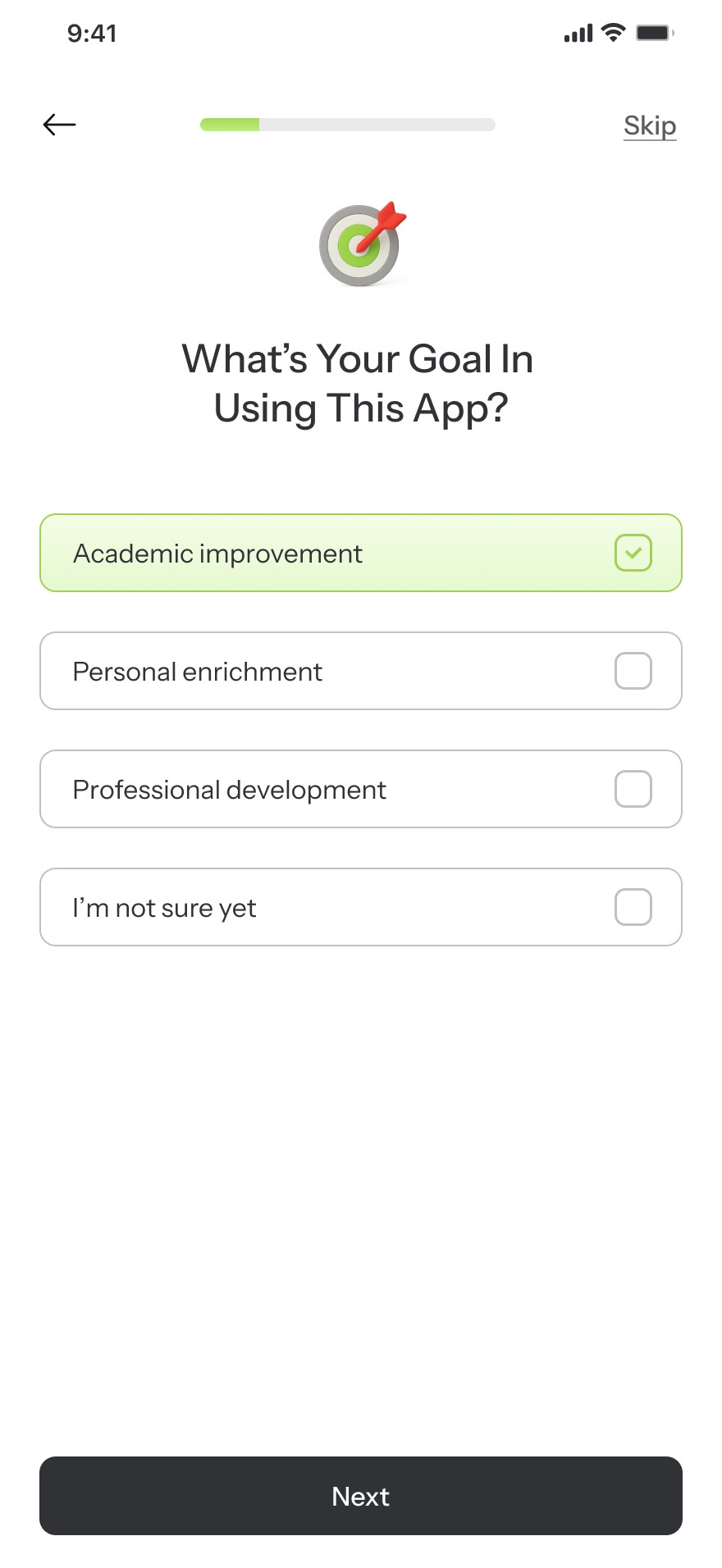
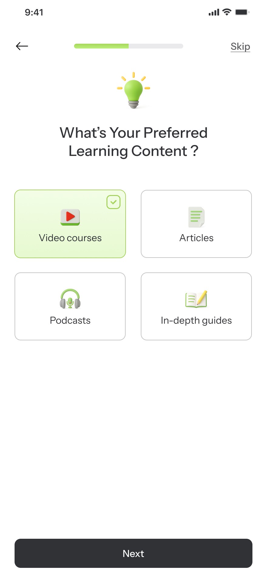
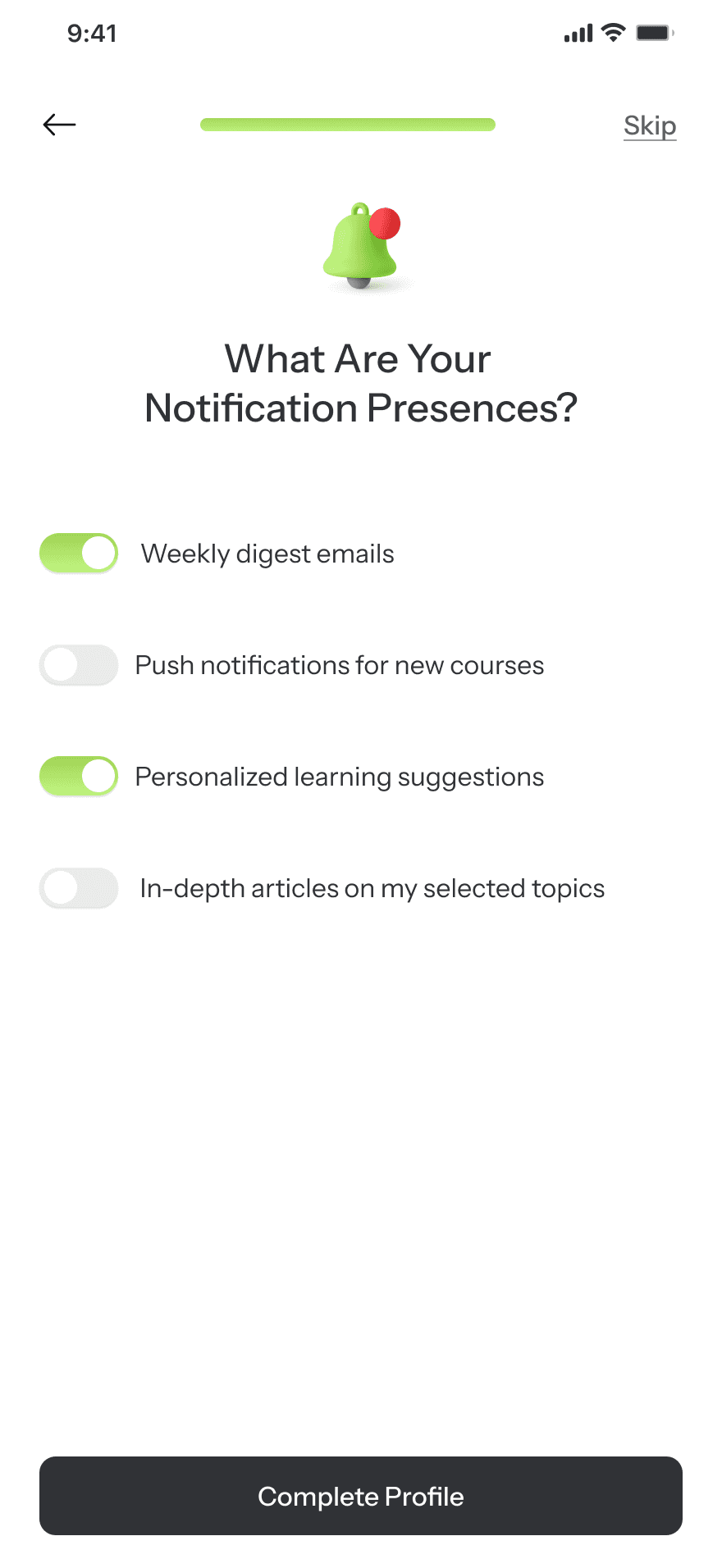
08. the solution
A System That Learns While You Learn
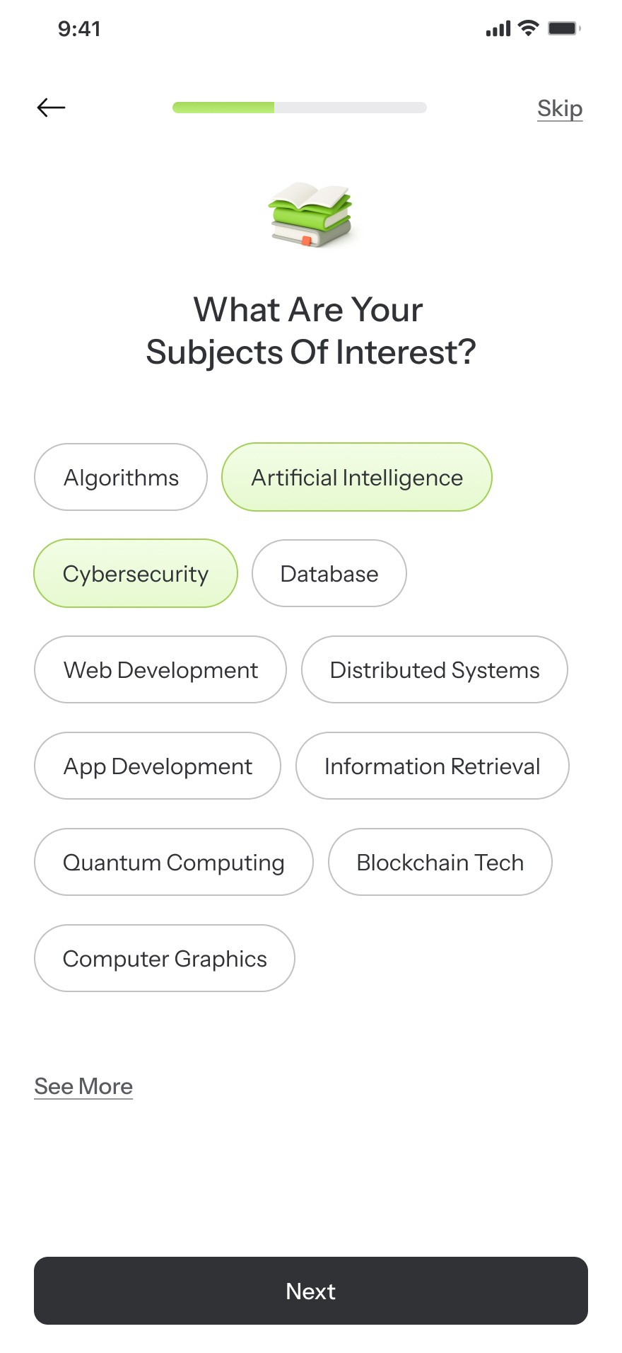
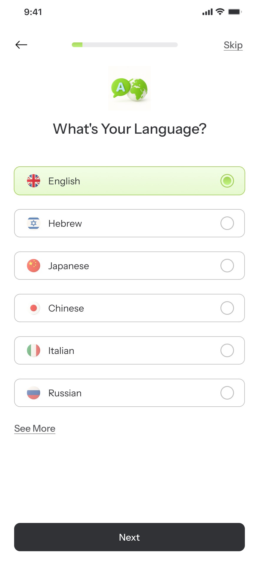
Starting with Intent: A Personalized Onboarding Flow
The app begins with a ten-step onboarding flow, where each screen asks a single, focused question. This approach helps users clarify their learning goals without cognitive overload, laying the groundwork for meaningful personalization later in the experience.


Exploring Freely, While the System Listens
In this stage, users explore the app based on two parallel paths: their own interests and the personalized suggestions offered by the system. This interaction is essential, it not only empowers users to navigate freely but also allows the system to learn from their behavior and preferences in real time, laying the foundation for future tailored learning paths.


Your Learning, Structured Around You
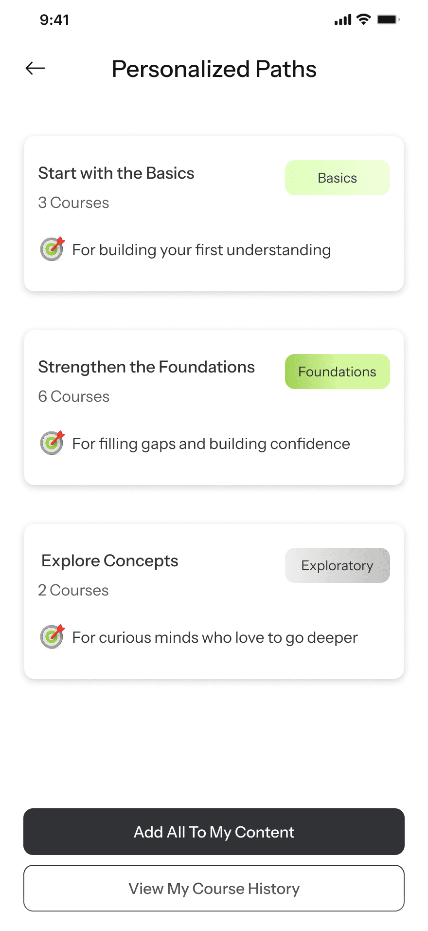
Based on the user’s goals and interactions, the app presents tailored learning paths to choose from. Each path is thoughtfully ordered to guide the user through relevant content in a meaningful, goal-oriented sequence, helping turn exploration into structured progress.


09.style guide
A Friendly UI That Doesn’t Get in the Way
I used illustrations selectively in onboarding and key transitions to support clarity and engagement, without distracting from functionality. They serve as visual anchors for meaning while breaking up heavy text, helping maintain a clean, focused interface.
The illustrations were created by me using AI-based tools.
Typography
Aa
instrument sans
Page Heading
24px / semi bold
Section Heading
16px / semi bold
Subheading
14px / Meduim
Body Text
16px / Regular
Secondary Text
14px / Regular
Subtext
12px / Regular
illustrations


Icons
colors
#E2FFBE
#C9F189
#303236
#FFFFF
10.self reflection
Thoughts from the Process
One of the main challenges in this project was crafting questions that felt clear and relevant, without overwhelming the user or sounding too formal. My focus was on giving students a clean, straightforward path, while still adding just enough color and energy to keep the experience from feeling dry.
When working on the learning paths section, I found myself debating how structured the experience should be. Should I guide users more firmly, or give them full flexibility? In the end, I offered three different paths. each with a different level of focus. so students could choose what fits them best without feeling boxed in.
Balancing clarity with personality turned out to be more nuanced than expected, and surprisingly satisfying.
Let’s get in touch!
Curious, motivated, and ready to collaborate.
noavano22@gmail.com
© By Noa Vano 2025
UX/UI Case Study
Learnet - Smarter Academic Guidance
Helping students navigate overload and focus on what truly matters
Timeline
Jan - Feb 2025
Product
B2C app
Target audience
Academic students
Project
Personal initiative
Overview
Designing Clarity in an Overloaded Learning Space
Access to learning has never been the problem, direction has. Students are surrounded by courses, platforms, and recommendations, yet often feel unsure what to learn, in what order, and why. Most learning platforms focus on delivering content, but offer limited support in helping students navigate their goals, progress, and personal learning needs.
This project examines how a personalized learning system can provide structure without limiting exploration.
By combining user research, competitive analysis, and behavioral insights, I designed a concept that adapts to each student over time, guiding them from open ended exploration to focused, goal driven learning paths that evolve as they do.
01.problem statement
Drowning in Options, Missing Direction
Students struggle to filter through the abundance of available content to find what truly fits their personal learning needs.
Most platforms focus on structured courses, lacking accessible and relevant materials that address individual
academic challenges.
“There’s so much out there… I don’t know where to begin”
“It often feels like platforms just tell me what’s popular, not what actually fits me.”
02.industry context
One-Size Platforms. Missed Needs.
While many EdTech platforms today incorporate smart recommendations, in the academic space, most systems still rely on rigid course models and offer only surface-level suggestions, missing deeper insight into students’ goals, habits, and long-term progress. As academic learners seek more tailored and flexible experiences, the need for systems that adapt continues to grow.
03.competitors analysis
Are Existing Solutions Really Personalized?
I chose Coursera, edX, and Udemy because they represent distinct approaches to online learning, each targeting students differently. They also share a strong academic orientation, making them relevant benchmarks for my analysis.
Feature
Smart
Student Profile
Personalized content
Learning
Path Structure
Basic profile with
limited customization
suggestionss based previous courses
Pre determined suggestions
Basic profile with
course history
Basic suggestions based on selected interests
Fixed "MicroMasters"
and program paths
Basic profile
with limited personalization
Algorithms prioritize
sales over learning
Standalone courses, No structured paths
Learnet
Profile tailored to
goals and interests
Content tailored
to interests
and behavior
Adaptive
learning paths
⚠️
This sign represents very limited feature.
04.user research
Are Today’s Platforms Really
Supporting How Students Learn?
I designed this survey to reveal what students actually need, not just what platforms assume. The hardest part? Asking the right questions, and listening between the lines.
“What are students
really struggling with?”
Goal
Understand how students experience academic platforms , focusing on personalization, challenges, and learning habits.
Method & Tools
25-question survey combining open-ended, scaled, and multiple-choice questions. It was distributed via Facebook and WhatsApp, collected through Google Forms, and analyzed using ChatGPT.
What’s the easiest way to hear what students really think?
“Whose voices are we
actually hearing?””
Participants
30 students from diverse academic fields.
Top disciplines: Engineering (30%),
Economics (12%).
05. Key Insights
So, what stood out?
The research revealed key patterns in how students interact with learning platforms. Many feel overwhelmed by the sheer volume of options, struggle to find content aligned with their goals, and lack a clear sense of progression. These insights helped shape a solution focused on simplicity, relevance, and personalized learning paths.
What’s Still Missing?
66%
Struggling to find personalized content and guidance.
23%
Find it Difficult to filter
relevant information.
33%
Frustrated by scattered information across platforms.
Lack of Structure
Learners struggle to know
what to learn next without
clear direction.
Search ≠ Relevance
Students search often, but results rarely match their academic goals
Overwhelmed by Choice
Too many options create friction at the start of the learning process
06.user flow
From Overwhelmed to On Track
Instead of a single linear flow, the experience is built around a few interconnected flows, each tied to a key task: creating a profile, exploring relevant content, and receiving personalized learning paths. Together, they support a flexible and personalized user journey.
Start/End
Process
Home Page
decision

07.wireframes
Making Structure Student-Friendly
While the wireframes helped shape the structure and functionality, moving into high-fidelity design allowed me to refine the visual language to better serve the app’s goals. I aimed to create an experience that feels modern, approachable, and student-friendly, not just functional, but enjoyable and accessible. These screens helped validate whether the interface communicated clarity and comfortably aligned with the needs of today’s learners.
Quick access to search by keyword for any content type
Top-level tabs allow users to switch content types with one tap – no nested menus
Curated recommendations appear first to guide new users toward relevant content
Badges help users assess relevance and difficulty at a glance
Sticky label indicates the current stage in the learning journey.
Quick access to first lesson in each course lowers friction to start learning.
Allows users to personalize their dashboard with relevant materials.
Completed status reinforces a sense of progress and achievement.
08. the solution
A System That Learns While You Learn
Starting with Intent: A Personalized Onboarding Flow
The app begins with a ten-step onboarding flow, where each screen asks a single, focused question. This approach helps users clarify their learning goals without cognitive overload, laying the groundwork for meaningful personalization later in the experience.
Exploring Freely, While the System Listens
In this stage, users explore the app based on two parallel paths: their own interests and the personalized suggestions offered by the system. This interaction is essential ,it not only empowers users to navigate freely but also allows the system to learn from their behavior and preferences in real time, laying the foundation for future tailored learning paths.
Your Learning, Structured Around You
Based on the user’s goals and interactions, the app presents tailored learning paths to choose from. Each path is thoughtfully ordered to guide the user through relevant content in a meaningful, goal-oriented sequence, helping turn exploration into structured progress.
09.style guide
A Friendly UI That Doesn’t Get in the Way
I used illustrations selectively in onboarding and key transitions to support clarity and engagement, without distracting from functionality. They serve as visual anchors for meaning while breaking up heavy text, helping maintain a clean, focused interface.
The illustrations were created by me using AI-based tools.
Typography
Aa
instrument sans
Page Heading
24px / semi bold
Section Heading
16px / semi bold
Subheading
14px / Meduim
Body Text
16px / Regular
Secondary Text
14px / Regular
Subtext
12px / Regular
illustrations
Icons
colors
#E2FFBE
#C9F189
#303236
#FFFFF
Let’s get in touch!
Curious, motivated, and ready to collaborate.
noavano22@gmail.com
10.self reflection
Thoughts from the Process
One of the main challenges in this project was crafting questions that felt clear and relevant, without overwhelming the user or sounding too formal. My focus was on giving students a clean, straightforward path, while still adding just enough color and energy to keep the experience from feeling dry.
When working on the learning paths section, I found myself debating how structured the experience should be. Should I guide users more firmly, or give them full flexibility. In the end, I offered three different paths, each with a different level of focus. so students could choose what fits them best without feeling boxed in.
Balancing clarity with personality turned out to be more nuanced than expected, and surprisingly satisfying.
© By Noa Vano 2025
UX/UI Case Study
Learnet -
Smarter Academic Guidance
Helping students navigate overload and focus on what truly matters.
Timeline
Jan - Feb 2025
Product
B2C app
Project
Personal initiative
Target audience
Academic students

Overview
Access to learning has never been the problem, direction has. Students are surrounded by courses, platforms, and recommendations, yet often feel unsure what to learn, in what order, and why. Most learning platforms focus on delivering content, but offer limited support in helping students navigate their goals, progress, and personal learning needs.
This project examines how a personalized learning system can provide structure without limiting exploration.
By combining user research, competitive analysis, and behavioral insights, I designed a concept that adapts to each student over time, guiding them from open ended exploration to focused, goal driven learning paths that evolve as they do.
designing clarity in an overloaded learning space
01.problem statement
Drowning in Options,
Missing Direction
Students struggle to filter through the abundance of available content to find what truly fits their personal learning needs. Most platforms focus on structured courses, lacking accessible and relevant materials that address individual academic challenges.
“There’s so much out there… I don’t know
where to begin”
02.industry context
One-Size Platforms.
Missed Needs.
While many EdTech platforms today incorporate smart recommendations, in the academic space, most systems still rely on rigid course models and offer only surface-level suggestions, missing deeper insight into students’ goals, habits, and long-term progress. As academic learners seek more tailored and flexible experiences, the need for systems that adapt continues to grow.
“It often feels like platforms just tell me what’s popular, not what actually fits me.”
03.competitors analysis
Are Existing Solutions
Really Personalized?
I chose Coursera, edX, and Udemy because they represent distinct approaches to online learning, each targeting students differently. They also share a strong academic orientation, making them relevant benchmarks for my analysis.
Scroll →
Feature
Smart
Student Profile
Personalzed Content
Learning
Path Structure
Basic profile with
limited customization
suggestionss based previous courses
Pre determined suggestions
Basic profile with
course history
Basic suggestions based on selected interests
Fixed "MicroMasters"
and program paths
Basic profile
with limited personalization
Algorithms prioritize
sales over learning
Standalone courses, No structured paths
Learnet
Profile tailored to
goals and interests
Content tailored
to interests
and behavior
Adaptive
learning paths
⚠️
This sign represents very limited feature.
04.user research
Are Today’s Platforms
Really Supporting How Students Learn?
I designed this survey to reveal what students actually need, not just what platforms assume. The hardest part? Asking the right questions, and listening between the lines.
“What are students
really struggling with?”
Goal
Understand how students experience academic platforms, focusing on personalization, challenges, and
learning habits.
“What’s the easiest way to hear what students really think?
Method & Tools
25-question survey combining open-ended, scaled, and multiple-choice questions. It was distributed via Facebook and WhatsApp, collected through Google Forms, and analyzed using ChatGPT.
“Whose voices are we
actually hearing?”
Participants
30 students from diverse academic fields.
Top disciplines: Engineering (30%) and Economics (12%).
05. Key Insights
So, what stood out?
The research revealed key patterns in how students interact with learning platforms. Many feel overwhelmed by the sheer volume of options, struggle to find content aligned with their goals, and lack a clear sense of progression. These insights helped shape a solution focused on simplicity, relevance, and personalized learning paths.
What’s Still Missing?
66%
Struggling to find personalized content
and guidance.
Lack of Structure
Learners struggle to know what to learn next without clear direction.
23%
Find it Difficult to filter
relevant information.
Search ≠ Relevance
Students search often, but results rarely match their academic goals
33%
Frustrated by scattered information across platforms.
Overwhelmed by Choice
Too many options create friction at the start of the learning process
07.wireframes
Making Structure
Student-Friendly
While the wireframes helped shape the structure and functionality, moving into high-fidelity design allowed me to refine the visual language to better serve the app’s goals. I aimed to create an experience that feels modern, approachable, and student-friendly, not just functional, but enjoyable and accessible.
These screens helped validate whether the interface communicated clarity and comfortably aligned with the needs of today’s learners.
Curated suggestions guide new users Badges show level and topic instantly. Search is accessible and universal. Tabs enable quick content switching.
Sticky label shows the user’s current learning stage. Completed status builds motivation and clarity.
Quick lesson access reduces friction.
Users can tailor their content list.
06.user flow
From Overwhelmed to
On Track
Instead of a single linear flow, the experience is built around a few interconnected flows, each tied to a key task: creating a profile, exploring relevant content, and receiving personalized learning paths.
Together, they support a flexible and personalized user journey.
Scroll →
Start/End
Process
Home Page
decision
08. the solution
A System That Learns While You Learn
Starting with Intent: A Personalized Onboarding Flow
The app begins with a concise ten-step onboarding flow, where each screen asks a single, focused question.
This approach helps users clarify their learning goals without cognitive overload, laying the groundwork for meaningful personalization later in the experience.
Exploring Freely, While the
System Listens
In this stage, users explore the app based on two parallel paths: their own interests and the personalized suggestions offered by the system. This interaction is essential. It not only empowers users to navigate freely but also allows the system to learn from their behavior and preferences in real time, thereby laying the foundation for future tailored learning paths.
Your Learning, Structured
Around You
Based on the user’s goals and interactions, the app presents tailored learning paths to choose from. Each path is thoughtfully ordered to guide the user through relevant content in a meaningful, goal-oriented sequence, helping turn exploration into structured progress.
09.style guide
A Friendly UI That Doesn’t Get in the Way
I used illustrations selectively in onboarding and key transitions to support clarity and engagement, without distracting from functionality. They serve as visual anchors for meaning while breaking up heavy text, helping maintain a clean, focused interface.
The illustrations were created by me using AI-based tools.
Typography
Aa
instrument sans
Page Heading
24px / semi bold
Section Heading
16px / semi bold
Subheading
14px / Meduim
Body Text
16px / Regular
Secondary Text
14px / Regular
Subtext
12px / Regular
illustrations
Icons
colors
#E2FFBE
#C9F189
#303236
#FFFFF
Let’s get in touch!
Curious, motivated,
and ready to collaborate.
noavano22@gmail.com
10.self reflection
Thoughts from the Process
One of the main challenges in this project was crafting questions that felt clear and relevant, without overwhelming the user or sounding too formal. My focus was on giving students a clean, straightforward path, while still adding just enough color and energy to keep the experience from feeling dry.
When working on the learning paths section, I found myself debating how structured the experience should be. Should I guide users more firmly, or give them full flexibility? In the end, I offered three different paths, each with a different level of focus, so students could choose what fits them best without feeling boxed in.
Balancing clarity with personality turned out to be more nuanced than expected, and surprisingly satisfying.
© By Noa Vano 2025