UX Case Study
A UX case study focused on restructuring a complex government website to improve clarity, navigation, and user understanding within strict design system constraints.
Timeline
Product
Target audience
Overview
Designing Clarity in a Government System
This project focused on restructuring the information architecture and navigation of the Israeli Authority for Urban Renewal website, within the constraints of the Israeli government design system.
The website contains a large amount of complex content and serves multiple audiences, from citizens with no prior knowledge to professionals and stakeholders. The challenge was to make this content understandable and usable without introducing new UI patterns or visual changes. The solution was a use intent driven structure. Content was reorganized into clear, purpose based sections, urban renewal plan types were explicitly differentiated, and documents were reclassified to reflect their actual use. Navigation was simplified by consolidating key information where possible and reducing unnecessary page transitions.
The result is a clearer, more navigable structure that helps users quickly understand their options, find relevant information, and know what to do next.
01.problem statement
The existing experience suffers from a series of structural and logical issues that go beyond audience targeting alone. Unclear information hierarchy, inconsistent terminology, mixed categorization logic, and ineffective navigation and filtering patterns combine to create an experience that is difficult to understand and navigate. Rather than guiding users through the content, the structure requires them to interpret the system themselves, increasing cognitive load and reducing confidence in finding relevant information.
02.Audience Overview
Analysis of site usage data shows that the majority of visitors are homeowners and residents seeking initial understanding of urban renewal and how it may affect their home or neighborhood. Questionnaire results indicate that over 60% of respondents belong to this group, while professionals represent a smaller segment. These users typically arrive without prior knowledge and look for orientation, clear explanations, and guidance on next steps, rather than detailed professional documentation.
03.Usage Insights
Google Analytics data shows that general informational pages receive the highest traffic, with tens of thousands of visits during the measured period (e.g., 30,000 visits to core pages). Early-stage topics such as urban renewal programs (13%), content related to the elderly population (17%), and project status (8%) attract significantly more attention than professional guides or regulatory materials, indicating that most users engage with the site at an early
stage of understanding.
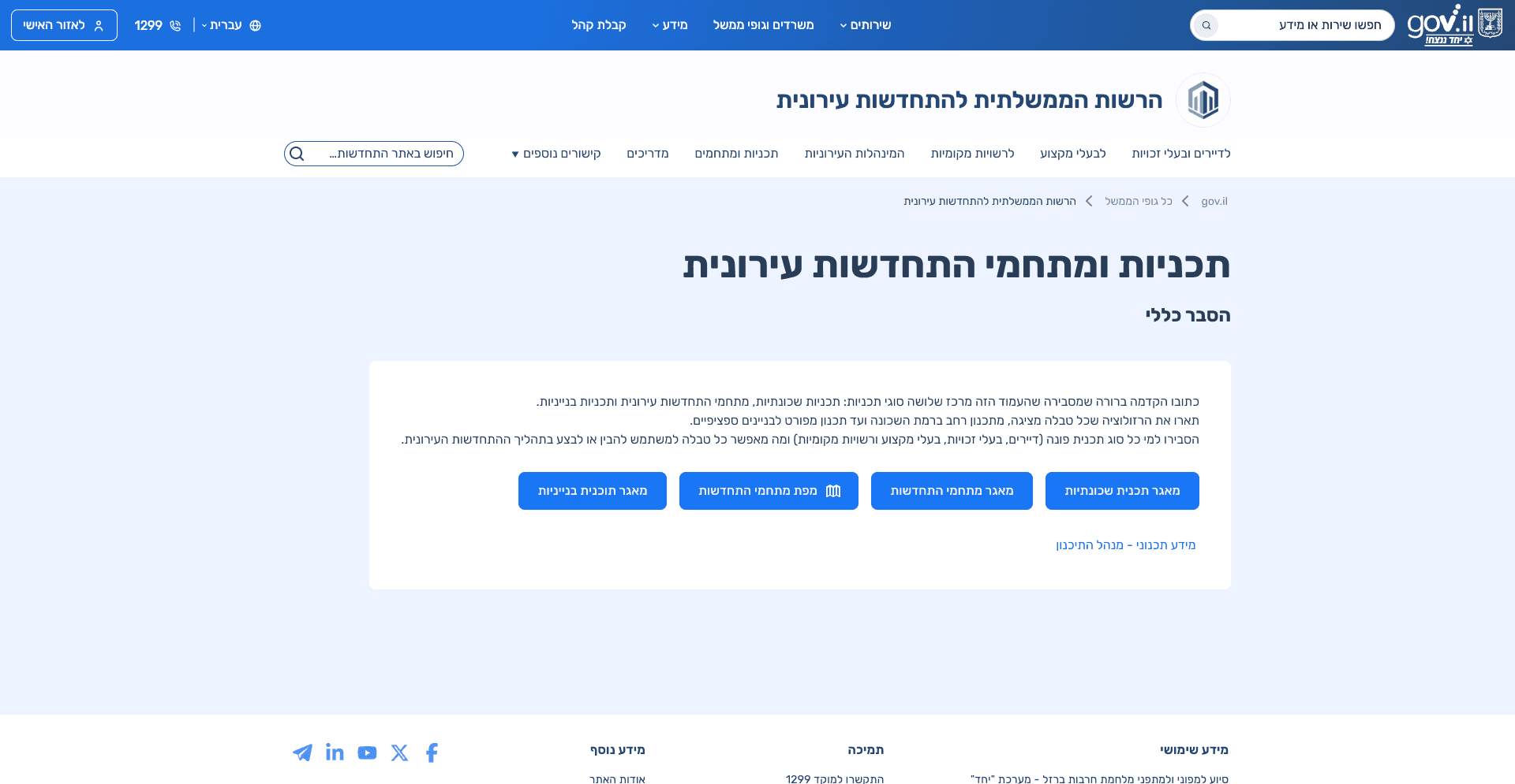
04. Existing Information Architecture Issues
The following screenshots highlight key usability and structural issues in the existing website, demonstrating how content complexity and unclear hierarchy affected user understanding.
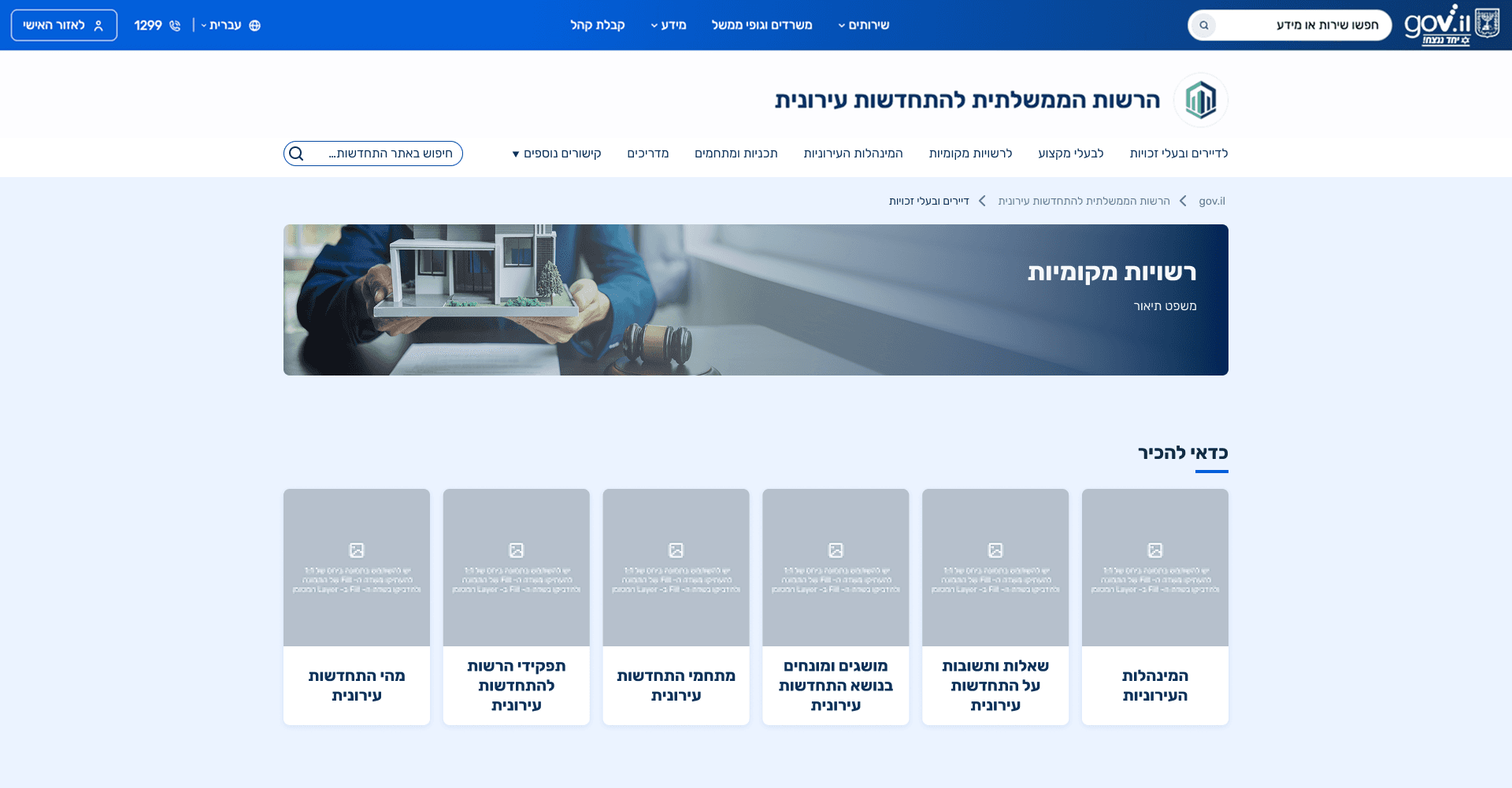
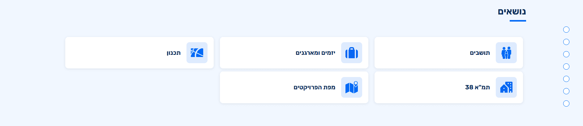
Main Navigation Lacks User Focus
The main navigation prioritizes a “Careers” section that serves a very small audience, while key informational topics and frequently searched content are missing or difficult to access.

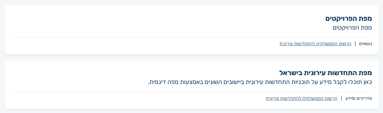
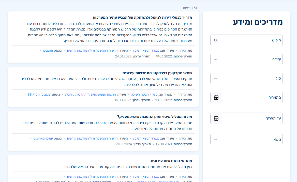
Inconsistent Terminology
The same tools and content are referred to by different names across the site, such as the map being labeled both as “Project Map” and “Urban Renewal Complexes Map,” creating confusion and reducing user confidence.
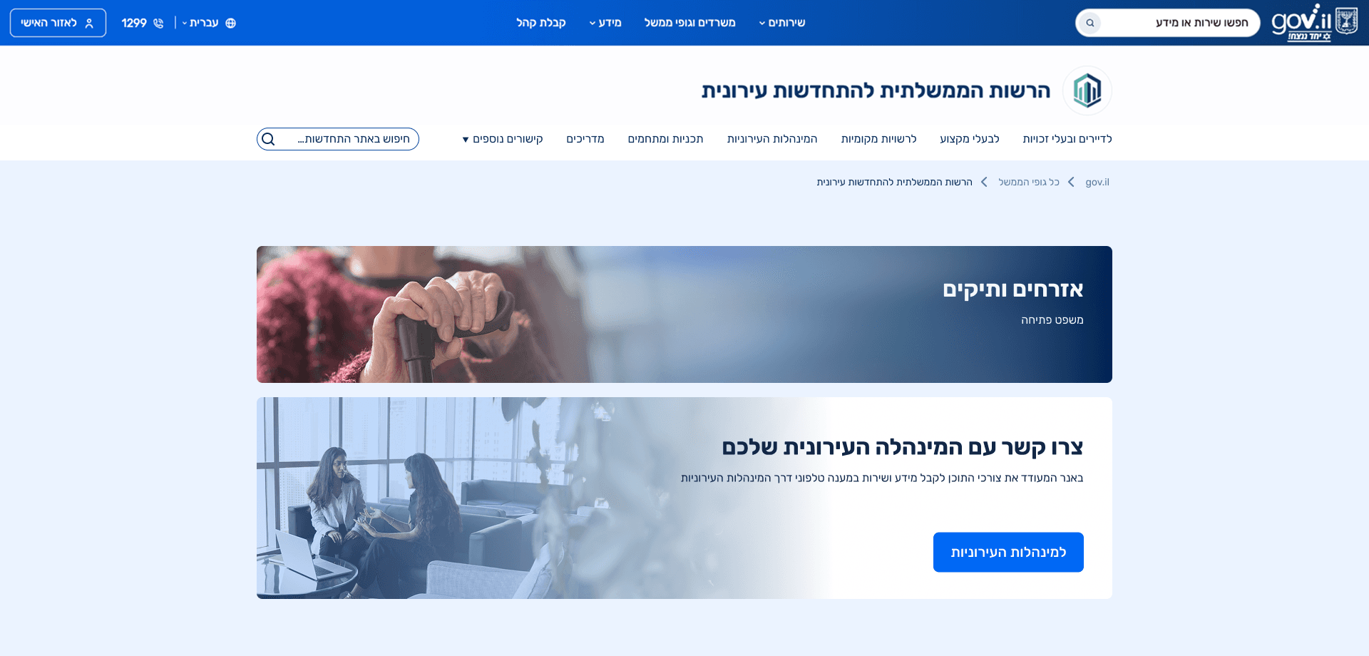
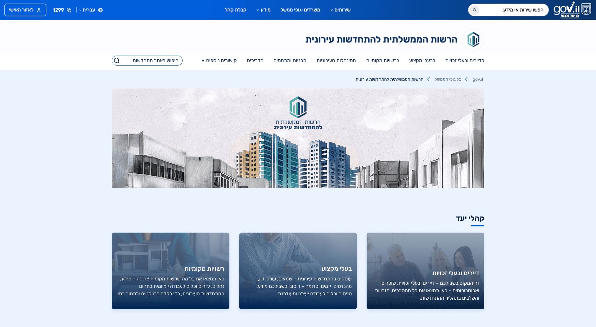
Services Without Audience Context
Services are presented without a clear audience based structure, making it difficult for users to quickly identify which services are relevant to them.
Mixed Audiences and Topics
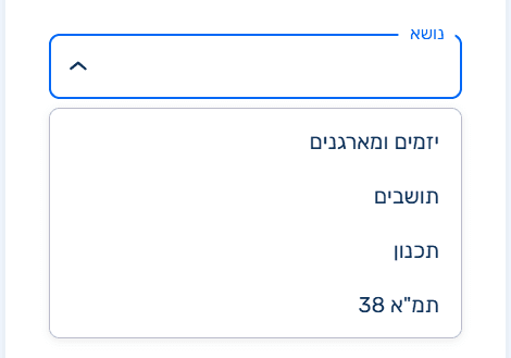
This section blends target audiences with subject based topics, making it unclear whether users should navigate by who they are or by what they are looking for, and creating confusion in the information structure.
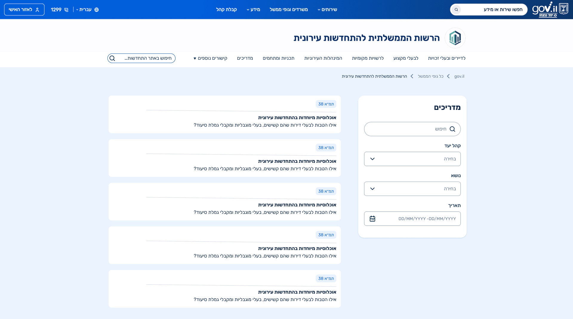
Incorrect Content Classification
Content was categorized based on technical page templates rather than its actual purpose, resulting in guides labeled as informational content and informational content presented as guides, which created confusion for users.

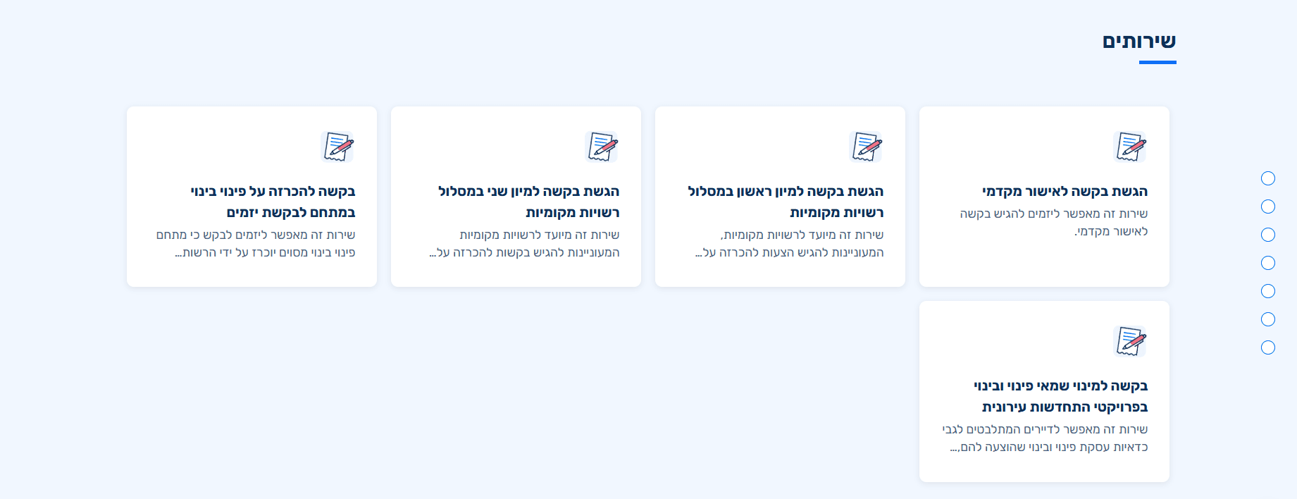
Unclear and Misplaced Filtering
The filtering logic is inconsistent, mixing topics with audience types, and is positioned too late in the flow to function as a meaningful primary filter.
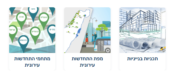
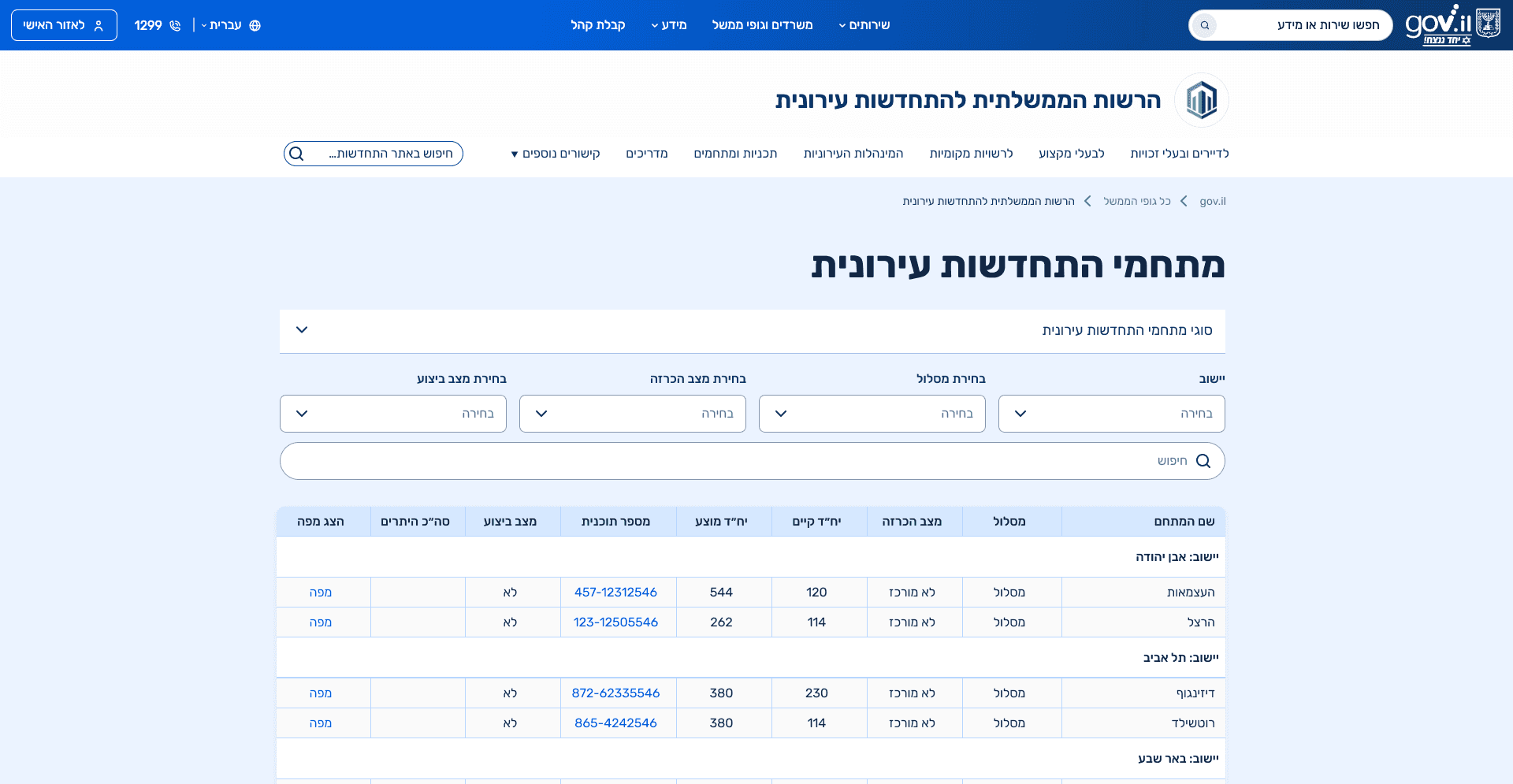
Gaps in Building Plan Representation
In the existing site, the “Planning” section focuses primarily on building level plans, while neighborhood-level plans are not clearly presented. The lack of context explaining the different planning levels makes it difficult for users to understand their options or see how their situation fits within the broader planning framework.

05.Context & Constraints
Constraints & Environment:
This project was carried out within the constraints of a government design system, with limited flexibility for introducing new UI patterns. Any deviation required validation against other government platforms and close alignment with development capabilities.
Designing With Technical Reality:
Design decisions were made in close collaboration with developers, supported by pattern research across existing government websites to ensure technical feasibility and system consistency.
06.UX Approach
The design process focused on simplifying complexity without oversimplifying the content itself. Given the broad target audience, the main guiding principle was progressive disclosure, allowing users with little prior knowledge to understand the topic step by step, while enabling experienced users to quickly locate specific information without unnecessary friction.
Key decisions:
Redefining the page structure based on user intent rather than content type.
Prioritizing clarity and hierarchy over visual novelty.
Reducing cognitive load by grouping related topics and eliminating repetition.
Minimizing unnecessary page transitions by consolidating content where possible.
07.Information Architecture
These diagrams show how content and navigation were reorganized to clarify structure, separate content by intent, and reduce cognitive load across the site.
Content Aggregation Structure
This sitemap shows how information is organized into content hubs, such as legal information, guides, and professional materials, allowing users to browse and filter content by type.
Site-Wide Navigation Structure
The navigation was redesigned to create a clear and consistent structure across the entire site. A distinction was made between global navigation and navigation within content hubs, ensuring that users can understand where they are and what type of content they are browsing at any given moment. Entry points were defined based on user intent, navigation depth was reduced where possible, and shared elements such as guides, legal information, and tools were intentionally reused across sections without mixing audiences or content logic.
08. Final Screens
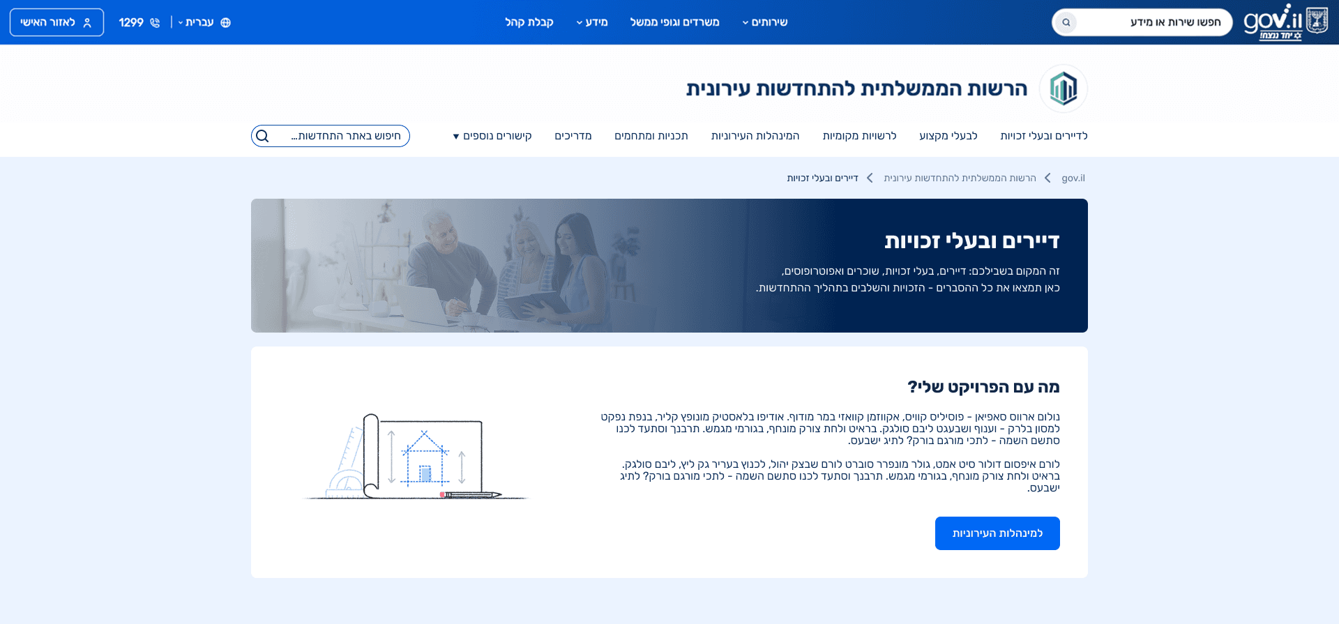
Clear Entry Points by User Type
The top navigation menu was redesigned to provide consistent access to the site’s main content areas, including guides, programs, and planning information. Menu items were structured to reflect user intent rather than internal terminology, making key topics easier to locate from anywhere on the site. This screen introduces clear entry points based on user type, allowing visitors to immediately identify the path most relevant to them, such as residents, property owners, or local authorities.
Residents Page, Clear Guidance by Need and Eligibility
This page is designed for residents and homeowners, opening with clear orientation and guidance. A key section directs users to municipal urban renewal authorities for project related checks, addressing a common resident need. Residents are then grouped by population types, such as the elderly, public housing residents, people with special needs, and building representatives, ensuring access to information and rights that are specific to each group.
Resident Subpages – Tailored Content by Population Group
Each subpage within the Residents and Homeowners section is tailored to a specific population group, such as seniors, people with special needs, public housing residents, and residents’ committees. A prominent call to contact the municipal urban renewal authority appears at the top of each page, recognizing that direct, human guidance is especially important for users who may struggle with complex digital information.
Content is then organized around group-specific rights, supported by relevant guides and additional resources, ensuring that users receive information that is both accessible and relevant to their situation.
Curated Content Hubs for Reduced Cognitive Load
Each content hub was carefully curated with relevant filters to reduce overload and maintain focus. In the guides section, tags were introduced to support quick scanning and flexible exploration, allowing users to narrow content by topic without navigating complex menus. This approach reduced cognitive load and made information more accessible, particularly for non professional users who need clarity rather than exhaustive detail.
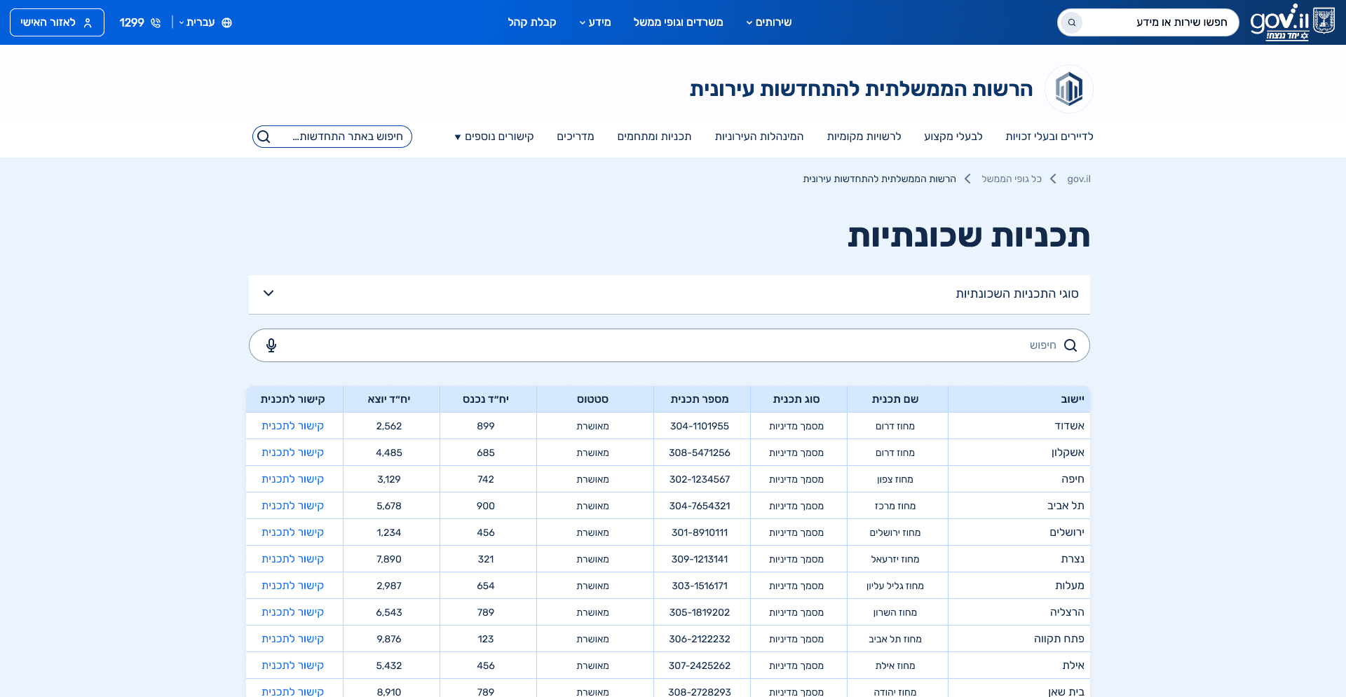
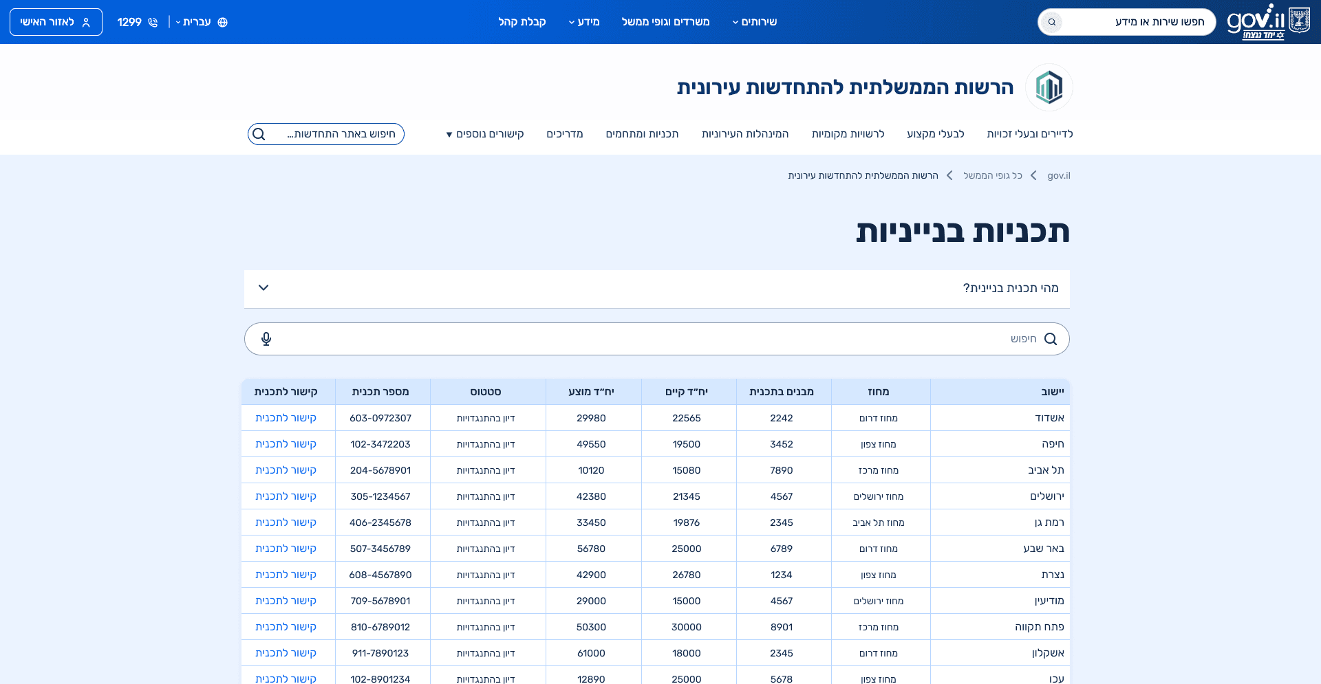
Centralized Access to Planning Types
This section consolidates all planning types into a single overview page that explains the differences between building-level, neighborhood, and district plans. Instead of forcing users to navigate between disconnected pages, the hub provides a clear comparison and context first, and then links to a dedicated page for each plan type. This approach supports both orientation and depth, allowing users to understand the landscape before diving into specific details.
09.self reflection
This project deepened my understanding of how to design information heavy systems for diverse audiences under strict structural and technical constraints. Working without visual freedom reinforced the importance of information architecture, content clarity, and hierarchy as primary UX tools. The process highlighted how misclassified content and unclear structures can significantly increase cognitive load, even when the visual design is consistent. In addition, close collaboration with developers strengthened my ability to translate UX intentions into feasible solutions, align design decisions with existing systems, and create scalable structures that can support future content growth.